You already know that it’s important to write attention-grabbing, effective headlines, but you’re not sure how to create those viral, shareable, clickable titles for your own blog posts.
True to our motto, we’re your business blog’s best friend and we’re here to help.
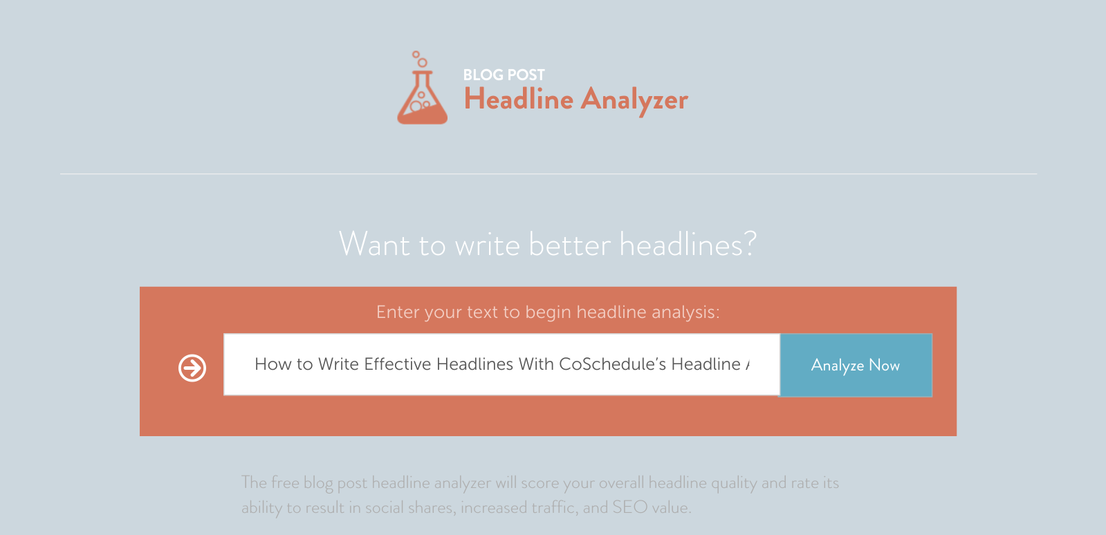
How to Write Effective Headlines With CoSchedule’s Headline Analyzer
Great headlines are more than just clickbait, but there’s an overwhelming number of different opinions out there about the “best” headlines. Instead of adding my opinion to the chaos, I’m going to provide some simple, practical information about how to write effective headlines using the features offered by CoSchedule’s Headline Analyzer.
You can check out this super useful tool from CoSchedule here.
(Photo via CoSchedule)
Below, I’ve laid out the features offered by this nifty headline analyzer, plus:
- What it does.
- Why it matters.
- How you can use it to write better headlines.
This tool is fantastic, but it’s not a silver bullet. Don’t waste your time trying to get perfect scores on every headline; your time is better spent exploring the other great information provided or contemplating what’s unique about your audience.
The Score
OK, so I just said that the score given by the analyzer isn’t the most important data point. But it can definitely be useful.
1. What it does:
The score (out of 100) gives an overall assessment of your headline based on the data from each of the analyzer’s tools. CoSchedule doesn’t discuss exactly how it’s weighted, but based on the headlines I’ve tested, I suspect that some factors are weighted much more heavily than others.
Want some proof?
The headline, “Write Effective Headlines Using CoSchedule’s Headline Analyzer Tool,” gets a sad score of 33. When you reduce the word count by removing the word, “Tool” (which improves that metric), the score only rises to a still disappointing 39. An addition of 6 points. However, if you take the original and make it a “How To” headline type, “How to Write Effective Headlines Using CoSchedule’s Headline Analyzer Tool,” the score jumps 23 points to a 56. Thus, look beyond the score!
One more warning—something the score does NOT do is give an accurate assessment of quality. Seriously. You can write some really terrible headlines with really good scores. For example, the headline, “How To Be Super Duper Amazing In Every Way” gets an 83.

(Photo via CoSchedule)
2. Why it matters:
There are a lot of articles out there, like this one, that analyze famous headlines and use their low scores to indicate that the analyzer does not work. But the score is really just a small part of the larger tool, and it does have its uses.
The score is best seen as a relative assessment, and as such it’s a decent metric. You shouldn’t use this number exclusively, but it can be a great way to compare the (many) headlines that you come up with.
Really low scores (or really high, as we saw above) can also be red flags for poorly crafted headlines—always check out the data to see where you could improve.
3. How to use it:
The best way to use the score is to create as many different potential effective headlines as you possibly can, then compare the scores. You can also use the feature to dream up and/or alter your potential headlines. The headlines that ultimately are chosen to appear on your site should probably score better than a 55. Scores over 60 are solid, and anything over 70 is fantastic.
Don’t be discouraged if you get a couple of duds during this process; Upworthy curators are known to write more than 25 potential headlines for every piece of content they post, and QuickSprout says that finding the perfect headline takes as much time as writing the perfect blog post.
Ultimately, you should be using this feature to guide your process, rather than to make a decision. Basing a headline solely on the score could lead to bad things, like the headline, “Wow, Did You Know Crazy Beautiful Amazing?” This does not even mean anything, but it scores an 83, too.
Word Balance
There’s a ton of research out there about what kinds of words you should use in your headlines to make them more shareable. Then, of course, there’s other research to suggest that most of that research uses pretty poor “science.” I find the latter pretty compelling, but it’s hard to ignore some of the statistics out there about the types of headlines that people share like crazy.
This feature can help you focus your efforts on a holistic picture of the type of psychological effects that your headline will have on readers.

(Photo via CoSchedule)
1. What it does:
According to CoSchedule, effective headlines will have a balance of words from 4 different categories: common, uncommon, emotional, and power words. This feature categorizes each word in your headline, then offers you a letter grade (F to A+) based on your adherence to their ideal balance, which is as follows:
- Common words (20-30%) are basically just the small words that make a headline readable: “a”, “the”, “your”, and “what” are the kinds of examples given.
- Uncommon words (10-20%) are more unique or topical, although CoSchedule also includes a number of adjectives. Examples include, “beautiful,” “baby,” “heart” and “year.”
- Emotional words (10-15%) relate to concepts that make your reader feel a positive, negative, or another specific sentiment when they read your headline, such as “happy,” “danger,” “absolutely” and even “how to” (positive, intellectual).
- Power words (at least one) are a hard-to-define category that seems to be based on past effectiveness. CoSchedule says they are, “phrases that are well-known for inciting action.” Some examples from their site include, “what happened to” and “for the first time”. (To make this slightly confusing, they actually offer a free spreadsheet of “power words” used to create “emotional headlines.”)

(Photo via CoSchedule)
2. Why it matters:
CoSchedule says that a balance between these word types, “helps your post remain readable while commanding attention from your audience”. Each word type has a function:
- Common words make the headline more readable.
- Uncommon words grab your reader’s attention.
- Emotional words make your headline more shareable.
- Power words encourage action, making it more likely that a reader will click through to your content.
This feature can really help you sort out which parts of your headline are engaging your readers and improve your word-choice without changing the general meaning. You can use this to make sure that the headline is suitable for your specific content and audience.
There’s also a metric ton of evidence showing that emotional, effective headlines make readers more likely to not only read, but also to share your content. Kissmetrics has an awesome post about how to write emotional headlines in which they actually use the CoSchedule Headline Analyzer to illustrate their point (along with the Emotional Marketing Value (EMV) Headline Analyzer from the Advanced Marketing Institute).
If your main goal is to have your content shared (think: Twitter, Facebook, etc.), having a higher percentage of emotional words might help you achieve that.

On the other hand, if your main goal is to have a reader click through to your content (on a blog, for example), maybe surprise is your friend. Using a word that’s surprising in the context, or even a surprisingly negative word, might make readers more likely to click that headline.
3. How to use it:
Before you start churning out headlines to test, take a moment to think about your readers and define what they’re looking for. Have they responded to sensationalist headlines in the past? Or do they tend to be more excited by their intellectual curiosity?
You should also think about the main goals you’re looking to achieve with your headline (shares vs. click-throughs), as I explained above, as well as the type of content that will be presented behind the headline. Your goals may evolve over time, but if you don’t define a strategy or benchmarks to achieve, you’ll never know whether your strategy is working (or not).
Once you’ve outlined your goals and the goals of your audience, use the word balance tool to determine which headlines are best suited to your purpose.
Word/Character Counts + Keywords
These factors are the most relevant for SEO, so this section is definitely worth paying attention to.
1. What it does:
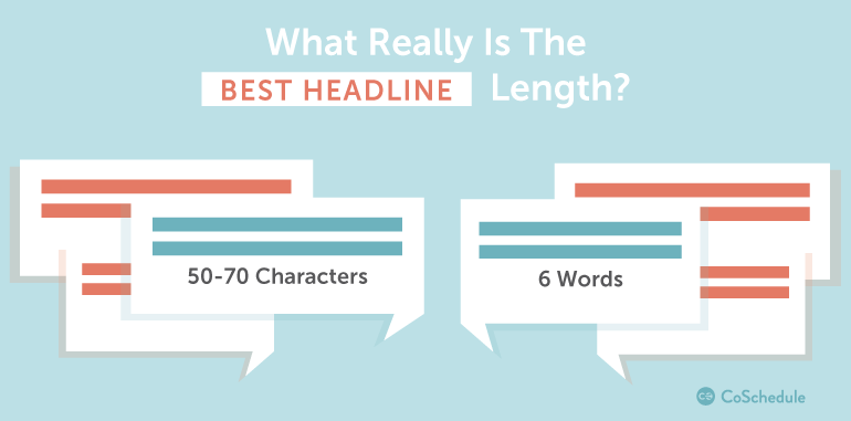
The word and character counts are pretty simple features, but they’re quite useful, too. Basically, the analyzer shows you the length of your headline in terms of word count and character count, then gives you a recommendation of whether you should shorten or lengthen it. These recommendations are based on whether the headline falls close enough to the lengths that CoSchedule considers to be ideal: 55 characters and 6 words.
I’ve determined that the length ranges that the analyzer deems effective (high scoring) are anywhere from 30-65 characters and 5-9 words.

(Photo via CoSchedule)
The Analyzer is also able to pick out words or phrases from your headline that might be considered “searchable”. It doesn’t pick out really long-tail keywords, but can give you an idea of the main “topics” or themes in the headline.
 (Photo via CoSchedule)
2. Why it matters:
In the amazing infographic created by Kevan Lee of Buffer, you can see that the ideal length for a headline actually differs based on the platform where you are publishing. He suggests that the best headline lengths by platform are:
- Twitter: 71–100 characters
- Facebook: 40
- Google+: 60
- LinkedIn: 80–120
- Email (Subject Lines): 28-39
That’s a pretty big spread. CoSchedule’s Julie Neidlinger argues that you can really write great headlines at any length, but she also suggests that sticking to the middle of this range might help you write headlines that fare well across platforms in this age of much cross-publishing.
Headline length is not only important for those optimizing for Google or Bing—it’s also about how your reader goes about reading them. Many of you have probably heard that readers often only read the first three and last three words of a headline.
So here’s the reasoning from Kissmetrics behind the ideal length of a headline:
A headline you can read in a single glance obviously communicates its content more effectively than one you cannot. Usability research shows that people not only scan body copy, but headlines as well—and they tend to take in only the first and last 3 words. This suggests the perfect length for a headline is 6 words.
However, that same article also notes that some of the most effective headlines on the web (in terms of conversions) are up to 30 words! The moral of the story? Making your words count is more important than the exact length, but paying attention to optimal lengths for SEO probably won’t hurt.
As for the keywords, anyone who has fought their way through a search for the perfect long-tail keyword will know that this is sort of like potty training a toddler. You can get all the scientific advice in the world, but ultimately, you just have to make some personal decisions about what’s most effective in real life.
There’s an overwhelming amount of information out there about why keywords are important, so I won’t make you read it here. Check out this article if you want more of the meaty goodness that is keyword research.
3. How to use it:
Use the length features as guidelines. If you have really stellar, effective headlines, you might be able to ignore these. However, for the everyday blog post, it’s nice to see how many words and characters you’re using. Shoot for more concise, focused headlines and take their suggestions as opportunities to revise anything confusing or unwieldy.
The keywords are not prominent on the analyzer, but they can be really helpful. If your keyword isn’t showing up (or any part of it), you might want to take a second look at your choice.
You should also use these features to make sure that your keywords are well-positioned. Remember how we said that readers only look at the first three and last three words? Well, that seems like a pretty good reason to stick your keyword in one of those positions. If at all possible, put it in the first three.
…at least be sure the first three words are a stand-alone powerhouse. If you go past the ideal character or word count, or your headline gets clipped at the end, the best part is still visible doing its job.
One more cautionary note: be careful that you don’t load too many different keywords into the title. An article should have one central purpose, and readers who are confused about the contents of an article probably will not bother to read it.
Headline Type
1. What it does:
Super simple. This just categorizes your headline into a “type”. Here are the types that they include:
- Question
- How To
- Lists (“5 Ways to…”)
- Generic (everything else)

(Photo via CoSchedule)
2. Why it matters:
Buffer has some great posts about the psychology of headline strategies and what words you’re likely to see in viral headlines. These guys move beyond CoSchedule’s simple categories, but the principles are the same.
Question headlines are known to stimulate curiosity, which can be a powerful motivator for click-throughs. If people just have to know the answer to your question, they’re pretty likely to read your content. When someone is searching for content about how to do something (or, how to do something better), how-to headlines convey that you’re going to provide concise, informative descriptions of exactly that.
As for the list effective headlines that we see everywhere these days, well, take it from CoSchedule’s Nathan Ellering:
List posts work. Buzzsumo teamed up with OkDork to share data that basically says list posts get the most social shares, after infographics.
3. How to use it:
Think about whether your readers are more likely to be motivated by easy learning (“how to”) or curiosity (questions) and consider the type of content you’re presenting. Can it be put into a list form? Great, go for super-sharable lists as the effective headlines.
This tool is mostly a great reminder to avoid generic headlines when possible. However, many, many successful headlines are generic. If you aren’t using one of their broad types, you might want to focus a bit more attention on using strong, emotional words or surprisingly bold statements for effective headlines.
Visualizations
1. What it does:
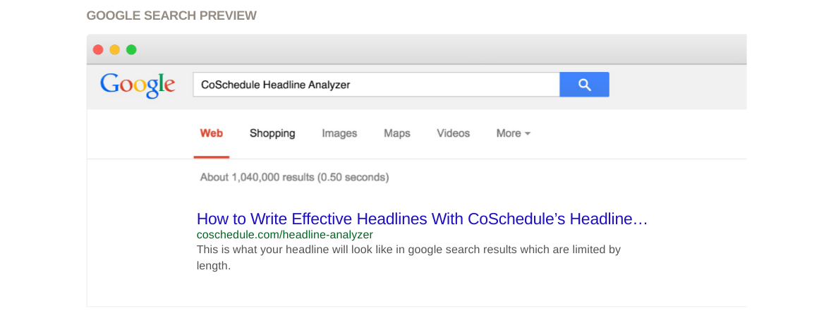
At the bottom of each headline analysis, this tool allows you to see what your headline looks like in Google and as an email subject line. You probably could figure this out from the character counts, but now you don’t have to!
(Photo via CoSchedule)
Actually, even for headlines that exceed the character count allowances for Google, it’s not a bad idea to take a look at the visualization. The tool can show you whether your keywords show up there in full, or whether your headline sends a coherent message in the first few words.
The tool also highlights your first and last three words for further consideration.
2. Why it matters:
Remember how we talked about readers checking out just the first three and last three words?
In psychology, this phenomenon can be chalked up to two really important effects: the primacy effect and the recency effect. Primacy deals with whatever we encounter earliest and recency is defined by the end of an experience—whatever we have encountered most recently.
Primacy is important in all three of these visualizations. If your reader doesn’t know what your article is about by reading the first few words, they might not be inclined to open your email, click through to your blog post, or pick your page from Google.
3. How to use it:
This is a good way to double check the headlines that have performed well by other metrics. Before you send that headline out into the ether, please make sure that it looks good on Google. What’s the use of optimizing the content of the article for organic search if no one will click on the headline?
Now That You’re a Headline Superstar…
It’s time to focus on the content itself.
Whether you write your own blog posts or let Verblio (formerly BlogMutt) do the work, learning how to write effective headlines will improve your click-through rates and get the content to the people. Good luck!


